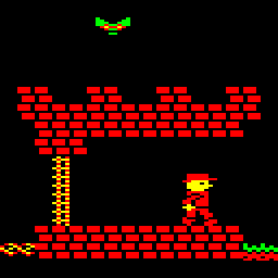
With the game released and only minor additions to the diary, I thought I'd take a little time to review development of the game and write down my thoughts about it. It received some positive reviews from the kind folks at stardot and I think it turned out to be a nice little game. While, in some ways, it is quite different to the game I first imagined, it captures something of the spirit of simple, old games that I would have liked to have played as a child.

The game took over three years to make, though work was not constant over that period. As the game progressed, features were added and removed, levels were designed and redesigned, and approaches to basic functions of the game were often reconsidered. Hopefully, I'll be able to say something about the things that worked, those that didn't work, and how development could have been done better. Rather than have a list of each, I'll pick one of each for each installment to keep the tone from getting too positive or negative.
The scrolling routine in the game uses a trick to make it appear that the scenery is moving two pixels at a time. The scenery is redrawn four pixels at a time, and this could always have been used in a game if the two pixel trick hadn't worked, but I initially wanted to see if the trick was a viable way of faking smoother scrolling. A combination of Ophis for assembly, Python for scripting automation, and Elkulator for testing proved very useful as I began to realise that a reasonable horizontal scrolling effect could be achieved. Still, it was at least a month before leftwards scrolling was implemented. By the time the Christmas break started, there was the basis for a game.
The basic principle behind the level format is to express platforms as spans of tiles because we are only interested in updating the screen at their ends. The bank switching trick used to simulate two pixel scrolling gives the impression that the whole span of tiles is moving. As the diary began, I had started to rethink how the ends of spans should be plotted. Initially, the plan was to have special joining tiles for each combination of regular tiles (brick, grass, blank) that could occur, but that could turn out to be wasteful if there were lots of combinations. At the expense of adding complexity to the plotting routine, I switched to an approach that merged parts of tiles when drawing the ends of spans.
The initial format used to store tile data was also too restrictive, as discussed in the diary. The way special tiles used for keys, doors and treasures were stored also needed to be updated. As the diary reveals, but this needed more revision later. The format settled down in the end, for collectable objects at least, but some thought ahead of time would have helped. Still, in the early days, I wasn't sure just what kind of game I was writing.
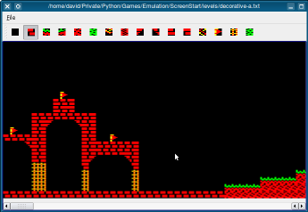
Quite early on in the development process, I got tired of editing the levels in a text editor and decided to write a nice graphical one. This coincided with a slow period in development of the game itself where I realised that I would have to implement collectable objects and start to think about enemies. The initial idea was to write something that I could use to create the levels, but I started to think that it might be nice to make certain aspects of the user interface flexible, with the thought that other people might possibly want to design levels later. Since I later decided on a game concept that precluded the idea of user-generated levels, this flexibility wasn't really required.

Still, I added more features to the editor that helped with my own levels, such as support for monsters, portals and level colours. However, many of the basic tasks, such as defining collectable items, needed to be done by editing the level files themselves. The last feature to be added to the editor was to show the position on the map where the game will end, and this is not editable in the user interface at all; the feature was rushed in at the last minute just to get the game finished.
Once the basic game was written and with some of the more daunting features, such as collectable items and monsters, basically implemented, it was easy to get distracted by relatively unimportant things, like the title screen. Later in development, again during a phase of uncertainty about the type of game being developed, I experimented with map features such as breakable tiles. Once features such as portals had been implemented, linking areas of the map together in a non-linear way, the existential crisis I had about the game largely disappeared and it became easier to focus on a simpler game concept with fewer superfluous features.

The breakable tiles feature was removed due to space restrictions, but it became unnecessary when portals were introduced since the game no longer needed a way to partition areas of the game map into levels, or allow one-way access into special or secret areas. It was also a move back towards purity in the game's design as the feature required the game's map to be modified and reinitialised before each game, whereas the existing framework for map modifications only involved changing the visibility of special tiles in a collection of flags.
These were a nightmare to deal with from the beginning. Since the scrolling is basically done in software, we can't expect monsters to be moved automatically when the player's character causes scrolling to occur. So, they have to be moved differently in the case where the player moves horizontally. Additionally, they need to be treated differently when they reach the edge of the screen, or when they leave the screen. Again, I didn't really consider these cases in the beginning, so the coordinate system was initially the same as the modified screen coordinates used for the player's character, but this had to be changed to represent a horizontal area wider than the screen to handle plotting of monsters at the edge of the screen. It was also necessary to consider when monsters should be created and destroyed. We create them when their starting positions become visible to the player and destroy them when they leave a wider area, so they are allow to roam without being forgotten.

The game only allows four monsters to be tracked at once, so the levels needed to be designed accordingly. One glitch mentioned in the stardot thread about the game's release occurs in the basement level when the player traverses the level from right to left. It could be that four monsters are already being tracked when the spider near the leftmost portal should be introduced, or perhaps the routine to manage this still has a lurking bug - not impossible - but it doesn't appear when it should do. Perhaps the algorithm for creating and destroying monsters should have been smarter about discarding monsters that are no longer visible in order to prevent cases like this one from occurring.
The player character's jumping behaviour is very old fashioned and diverges from that used by other more fashionable games. I personally prefer this, though I was initially unhappy about the asymmetry of it. Effectively, the upward part of the jump is specially designed to achieve a certain distance and height but I lazily delegate the downward arc to the falling routine. This gives a bit of a pouncing motion which takes some getting used to. Some players might not like the character's inability to change direction during a jump; I think it makes it more interesting to make players think before they jump, as in games like Frak! and Magic Mushrooms, rather than pander to any regrets they have just after they press the jump key/button. It also leads to interesting possibilities for jumping puzzles, though there is only really one place in the game where I take advantage of this behaviour.
This started out as a nice way to assemble the game code, encode the sprites and levels, and package everything up into a UEF file, ready for Elkulator to load. As I added more and more features to the levels, added more sprites and needed to manage the memory map a bit more effectively, the script became hard to maintain. The code to encode the levels also became difficult to understand after a while, especially after taking a break on the game. Although I thought generating constants for use with the assembler was a good idea, the code to do this wasn't really the clearest code I've ever written, and it probably indicates that I should have taken a step back to simplify things instead of pressing on with more changes on top of changes. In the end, though, the build script worked most of the time, and it made it easier and quicker to iterate on the game code, which is what really matters.
I was a bit disappointed with the ending I wrote for the completed game. With Jungle Journey, you at least get something interesting to look at; here, you get a slightly-fancy animated message and some music. However, that's really down to the lack of memory more than anything else and it would have taken time to reorganise code and data to try and find more space for something better, and it might only have been slightly better than the existing ending.
One of the things I coded then put aside was a routine to unroll a message on screen in a manner slightly like a roll of paper might unfurl. I had previously written a routine for the Archimedes that did this, but the limited screen resolution of the Electron didn't really have the same effect. Maybe I should have left space for an ending screen earlier in the development process. Perhaps a routine that could reuse existing data could have produced some nice visual effects given enough time to experiment.
I switched between different styles of level during development. Early levels were quite simple run and jump affairs. Later, when I started adding features like keys and doors, levels got more complex, and I even experimented with alternatives like shovels and rocks as I tried to make the game more interesting. The simple linear map was a constraint until I added portals to break the levels into separate pieces, and this is where it became possible to use different styles to depict different scenarios. Having said that, I still didn't seem to think that the gameplay was diverse enough and this led to the introduction of breakable tiles, but these were removed once I realised that they added more complexity for little benefit and I needed the memory for other things.
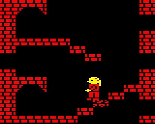
I'm quite happy with some of the styles in use, though a wider range of tiles would have been nice. Apart from the normal castle levels, the dungeon (blue) and caves (green) have their own atmosphere. The cellar (magenta) is also quite atmospheric, and is the only level where the dithering works quite nicely with the limited colour palette. It's a shame that the Electron only has primary and secondary colours in addition to black and white. Dithering can help, but only if you have access to a reasonable selection of colours to begin with, and the colours in the fixed palette of black, red and yellow don't mix well with many of the other colours available.
Copyright © 2015 David Boddie
Last updated: 2015-10-22 22:01:12 UTC
 This document is licensed under the Creative Commons Attribution-NonCommercial-NoDerivatives 4.0 International license.